The website must be user-friendly to improve behavioral factors. Regular audits can help identify if your site has any problems in this area.
A usability audit involves several steps:
- Check the Site’s Convenience for Users
Use services such as UsabilityHub or Hotjar. These tools allow you to collect feedback directly from users. For example, you can find out how convenient the navigation on the site is, whether visitors can easily find the necessary information, and what problems they face when using the site. - Analyze User Behavior
Google Analytics provides data on how users interact with your site. By analyzing this data, you can understand which sections of the site are the most popular, where users spend the most time, and from which pages they often leave the site. - Test the Mobile Version of the Site
The share of mobile traffic is constantly growing, so the mobile version of the site should be no less convenient than the desktop one. Google’s Mobile-Friendly Test tool can be used to check how well the mobile version of your site is adapted. It’s also important to regularly test the site yourself on different devices to ensure that all elements are displayed correctly and that there are no problems with navigation. - Conduct Surveys Among Site Visitors
Use pop-up forms or send out questionnaires to regular customers. This can provide valuable feedback about what users like and dislike about your site, and what they would like to see improved. - Regularly Update the Content
Make sure that the information on the site is always up-to-date. Outdated information can mislead users and negatively affect the site’s credibility. - Improve Site Loading Speed
A long load time can lead to a high bounce rate. Use tools like Google PageSpeed Insights to identify factors slowing down your site and take steps to optimize them.
The Impact of Website Usability
If translated literally, usability means “suitability for use.” The term itself already implies value. If the usability indicator is low, the website is inconvenient, and users achieve their goals less often than they could. This leads to three serious consequences:
- Positions in the Top of Search Engines
- Google considers behavioral factors when ranking. If users quickly leave an inconvenient site, it signals the search engines that it should be lowered in the search results in favor of others – more user-friendly sites.
- Website Traffic
- Remember, traffic is not only from organic search results. It also includes direct visits – via URL link from the “Favorites” in the browser or from the visit journal. Logically, an inconvenient site, unless it is unique in terms of content and offered possibilities, will have very few direct visits. Users are more likely to choose another, more user-friendly site.
- Achieving Website Goals
- If we’re talking about an online store or an online service showcase, it’s logical that low usability leads to decreased conversions. If a site is difficult to use, not all visitors, even if they are the target audience, will actually complete the desired actions. If the site is used for traffic resale, this goal will also be more difficult to achieve. The reasons for this are described in the two previous points.
Thus, working on usability is not just about caring for users. It is a purposeful improvement of key site qualities: the ability to rank in search and help visitors achieve goals important to the site owner.
Checklist: Usability Audit
There are several degrees of priority indicators according to which you should check your site during a usability audit.
Indicators with 1st Degree of Criticality
✅ Responsiveness
According to the advertising network, the share of mobile traffic in the internet space has reached 58%. Therefore, optimizing the site for viewing on smartphones is not just useful but necessary.
✅ Loading Speed
Internet access technologies are advancing, but the fact remains: only some parts of the world have access to 4G, not to mention 5G. Therefore, if a site takes longer than 1-2 seconds to load with good internet access, it’s already a bad indicator that turns away many potential visitors. People don’t like to wait: if your site loads slowly, they may leave to find another with similar content and functionality.
✅ Content Accessibility
This point is especially important if your site hosts advertisements, such as banners through RTB networks. Understandably, any banner takes up some useful part of the screen – this is normal. However, it’s certainly not normal if it causes the layout to shift or, for example, moves the “Close” button off the screen. The same applies not only to banners but also to interactive elements – such as a popup form for a callback service or an online consultant.
✅ Availability and Functionality of CTA Elements
This refers to forms and buttons like “Buy” / “Order” and other similar elements of the site. If they don’t work, the goal to which you should lead the user is technically unachievable. Ideally, one of the CTA elements should always be visible on the screen. For example, if a “Leave a Request” button follows the user on the side of the page.
Indicators with 2nd Degree of Criticality
✅ Presence of Key Information About the Product/Service
Such information includes descriptions, photos or videos, cost, options for configurations/tariffs. Don’t assume that photos and videos are only needed for products and not necessary for services. For example, if it’s a page about apartment moving, it’s important to show the fleet and rigging equipment.
✅ Clear h1 Headings
From the heading visible on the first screen, the user should understand in 1-2 seconds what the page will be about. Remember that a user can land on any page via a direct link, for example, from saved bookmarks. They should easily remember what the page is about and why they visited it.
✅ Contacts
A dedicated section where phone numbers, messengers, and email are listed is the bare minimum. If there is a possibility to purchase products offline, it is critical to have a map indicating store locations. If users can’t quickly understand how to contact you with questions, they are likely to be lost to you. Ideally, basic contacts and links to social networks should be presented in the website header so they are always visible.
✅ Company Information
Unless you are a brand at the level of Amazon, it is critical for users to understand that they are on the site of a trustworthy company. Office address, names of top managers, certificates and awards, brief history, etc. – the more substantial information available, the better.
✅ Sections like “Delivery,” “Payment Options,” “Warranty and Returns,” etc.
What specific service sections a particular site needs depends on its specifics. For example, an auto parts online store would need all the mentioned sections.
✅ Ease of Content Perception
Ideally, key information should be available in text format (so it can be easily copied, saved, or forwarded) and illustrated with media content – photos, videos, diagrams.
✅ Presence and Functionality of Product Filters
Filters familiar to most users – by price, characteristics, popularity – are important.
✅ Order Status Information
For example, if the website format implies that a manager will call the user after filling out an application, this should be stated after its completion. Ideally, you should be able to at least roughly orient the user about the time of the call: for instance, “we will call you back within 15 minutes.”
✅ Absence of Unnecessary Fields in the Application Form
Check each field for its necessity. For example, there is no need to ask the user to specify their full name if you will be calling them back. It is sufficient to leave a “Name” field where one can indicate a first name or first name and patronymic.
Indicators with 3rd Degree of Criticality
✅ Presence of Elements Simplifying Navigation
Check if you have a “breadcrumbs” menu at the top of the page, as well as a site search option and a “Back to Top” button on long pages. A clickable logo in the header leading to the homepage and a link to the site map in the footer would be useful. Work on the 404 error pages — add the possibility to return to the homepage and/or use the site search. Place icons with links to the company’s social networks in the footer or header.
✅ Presence of Additional Elements Simplifying Interaction with the Website
Add one-click registration, for example, through social networks. Work on the logical placement of elements in accordance with perception patterns — from left to right/top to bottom. Add highlighting of clickable elements and links, as well as changing the cursor appearance when hovering over them. If you have a map of branches, add a button to select a point on the map from a list or by clicking.
Checklist for Usability Audit
- First-Priority Indicators:
- Responsiveness: Given the high mobile traffic, optimizing the site for viewing on smartphones is essential.
- Loading Speed: Slow loading can deter potential visitors, especially given limited 4G access in many areas.
- Content Accessibility: Ensure that advertisements and interactive elements don’t obstruct content or functionality.
- Functionality of CTA Elements: These should be always operational and ideally visible on the screen at all times.
- Second-Priority Indicators:
- Presence of Key Product/Service Information: Includes descriptions, photos/videos, cost, and configuration options.
- Clear h1 Headings: The heading should immediately inform the user about the page content.
- Contacts: Essential information like phone numbers, emails, and a map if offline purchases are possible.
- Company Information: Trust indicators such as office address, top management names, certificates, and a brief history.
- Sections like “Delivery,” “Payment Options,” “Warranty and Returns,” etc.: Specific to the site’s nature and offerings.
- Ease of Content Perception: Key information should be available in text and supplemented with media content.
- Presence and Functionality of Product Filters: Standard filters like price, characteristics, and popularity.
- Third-Priority Indicators:
- Navigation Elements: Include a menu, breadcrumbs, site search option, a “Back to Top” button, and a clickable logo in the header.
- Additional Interactive Elements: One-click registration through social networks, logical placement of elements, clickable element highlighting, cursor change on hover, and a map for branch selection.
Free Tools for Usability Audit
A standard combination of Google Analytics can help conduct an audit.
Reports on visits from different devices will help you understand which gadgets, browsers, and screens the site is least optimized for. These same reports will help you understand the total traffic from such devices and choose priorities accordingly. For instance, if Safari browser users on iPhones leave the site more often than others, it is possible that the site is not displaying correctly in this browser. This should be checked and the error corrected if found.
Heatmaps show how users interact with content: how they fill out forms, where they click, and how far they scroll down the pages. For example, you might see that many users perceive an underlined text header as a link and try to click on it to go to a detailed section. It is quite possible that this can be used – indeed, create such a page with an easy way to reach form filling or another target action.
Audience composition reports will tell you which users you should mainly focus on. For example, if the site has many visitors aged 45 and older, it might be wise to ensure a well-readable and sufficiently large font.
There are also many paid services that provide not only data for analysis but also partially ready-made conclusions – made by machines, other users, or experts. In addition, the digital market offers a separate usability analysis service where a hired expert analyst goes through the entire checklist, provides conclusions and recommendations.
What to Do After Conducting an Audit
An audit itself is nothing more than gathering information. To benefit from it, you need to go through a fairly long cycle:
The audit itself is merely a collection of information. To benefit from it, you need to go through a fairly lengthy cycle:
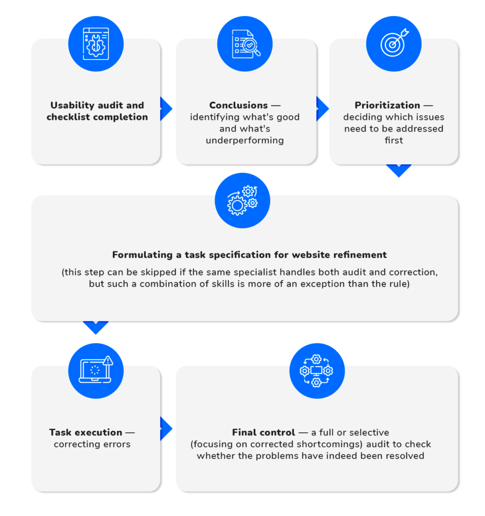
Addressing usability issues is a lengthy process. That’s why experienced SEO specialists analyze their sites regularly, not just when “red flags” appear. Typically, this is done once a quarter or semi-annually. Such an approach helps to regularly identify errors and correct them before they accumulate into a critical mass that could significantly impact the site’s performance.