Promoting a website is not limited to the search results seen by computer and laptop users. More and more users are accessing the internet via mobile devices. Additionally, searches are often conducted not directly through a search engine but via mapping services or directories. This should be taken into account when promoting, and you can successfully influence the success of such external optimization.
Today, more than half of all internet users access the web via tablets and smartphones, leading Google to optimize their sites for viewing on mobile devices. If you enter a query in a search engine from a smartphone, you’ll get a page of search results known as Mobile SERP.
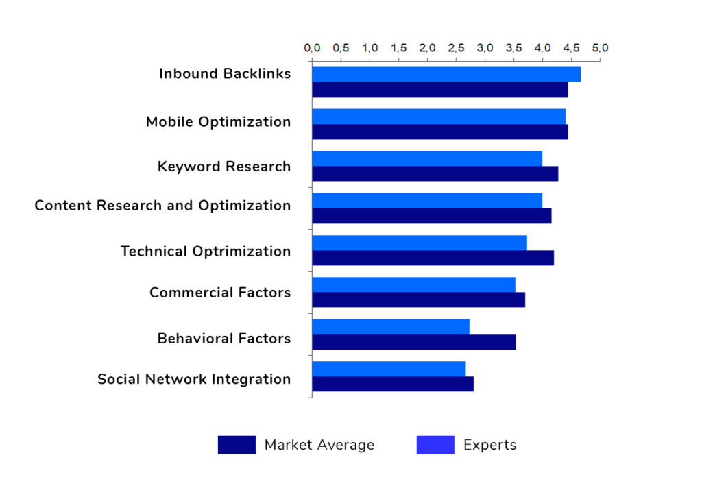
Most participants in the SEO study by Serpzilla recognized that for Google, the most important ranking factor is the link environment. The second most significant factor, according to respondents, is the site’s optimization for mobile devices.
As a result, SEO specialists must cater to users who view not only the desktop but also the mobile version of the search results.
Mobile Version of Website
One of the main questions in adapting your site for mobile devices is choosing the most suitable method. Essentially, the SEO-specialist needs to solve the primary problem – to make the resource convenient for full viewing on smartphones and tablets, whose screens are much smaller than those of laptops and desktops.
There are four ways to accomplish this:
- Responsive Design: This method is generally preferred by SEO specialists. It uses a single HTML code and URL for all devices. The page itself adjusts to the resolution and size of the device’s screen.
- Dynamic Display: Uses a single URL for all types of devices. However, the layout (code) of the page in each case will depend on the resolution and size of the screen.
- Mobile Version: If the site owner creates a special mobile version of the site, a separate subdomain or even domain is used. Visitors entering from mobile devices will be redirected to this alternative version of the resource.
- AMP: In this option, separate pages are created for viewing on mobile devices. They are stored on the search engine’s server – in the case of AMP (Accelerated Mobile Pages), it’s Google.
Each of these options has its pros and cons and will require different investments of time and money. For example, developing a separate mobile version is the most costly and time-consuming process.
- Checklist. Audit of the Mobile Version of the Site
Conduct an audit of the mobile version to ensure the site displays correctly on smartphones and tablets, especially if recent changes have been made.
- Compliance Check
Determine if your site’s mobile adaptation meets search engine standards. Enter the URL in special services that show “friendliness” to Google (search.google.com/test/mobile-friendly) algorithms.
- Manual Check
Load the main pages of your site from mobile devices, using developer tools or the browser settings menu, to see how the site looks in a mobile window. Check the content of the main and adapted versions – they should fully match unless you intentionally separated the content by type for different versions. Check the site’s layout for errors. Also, manually review pages in the browser and check the main conversion elements of your site – those that generate leads from traffic.
- Technical Elements Check
Get basic information about loading speed, convenience of text display (12px and larger), and elements. Also, try to make a call to the contact number listed in the contacts section with one touch. Check if prices and photos are correctly displayed on the main types of pages. Ensure the hamburger menu is working correctly.
- Load Speed Testing
Check the loading speeds of the main site pages using a special tool.
How to Improve Your Mobile Search Results
Having a mobile-adapted version of the site is a significant factor in its search positions. However, a drop in mobile search positions will also lead to a gradual decrease in the site’s positions in the main search. First, search engines will react to the decline in traffic and likely further penalize the site. Also, poor adaptability to smartphone and tablet screens can worsen the site’s behavioral factors.
To avoid this, it’s important to pay enough attention to optimizing the site for mobile traffic. To maintain and improve positions in the search results, it’s recommended to:
- Regularly conduct site audits according to the checklist described in the previous section.
- Analyze positions in desktop and mobile search results, comparing indicators.
- Based on the analytics obtained, draw conclusions about the need for additional work to improve the site’s positions in mobile search.
When promoting the site, also consider certain nuances. For instance, when creating the semantic core for the mobile version of the resource, keep in mind the differences between mobile and desktop queries. Mobile users often use search engine help – autocomplete finishes the entered phrase. Therefore, the list of typical queries may be different, and they also need to be promoted. If the site is specifically targeted at mobile device users, use such keys for link building.
Additionally, don’t forget about geography. Mobile devices allow for precise geolocation of users. This can provide more useful information from traffic analysis and help you increase the site’s effectiveness. For example, if a significant portion of users come from regions with poor internet coverage – say, rural areas – it might make sense to reconsider the content, for instance, reducing the number of heavy videos, replacing video banners with less connection-demanding formats. Also, knowing the regional affiliation of the audience will make it easier to add information useful specifically for them.
Another nuance to consider largely stems from screen sizes. In the desktop version, the top-5 and top-3 positions are the most valuable in search results, as they are visible upon page load. To see other results from the first ten, you need to scroll down. This is not relevant in the mobile version – usually, only the first site in the search results is visible, and it has the highest clickability. Mobile device users need to find an answer to their question as quickly as possible; they don’t have time to browse through the search results.
Therefore, when analyzing competitors – especially in the process of building the link mass of your resource – focus primarily on sites that occupy the first place in the top. By studying the absolute leaders of the search results, you can start buying quality links from trusted services and gradually try to push the top-1 inhabitants off their pedestal.