Conversion rate optimization (CRO) is the process of getting visitors on your website to take a desirable action. That might be filling up a form, getting in touch with you, or pressing the Buy Now button. Anything that leads your customers one step closer to purchasing your product is a conversion.
CRO is a vital part of SEO too. Conversion elements are the components of your website that make things easier for the visitor and reassure them that they are in the right place.
In this article, we’ll take a look at the importance of these conversion elements and how actual websites use them. We take the example of the banking and finance industry, because this is one of the niches where websites need to prove their credibility beyond doubt. Financial websites are part of the YMYL (Your Money or Your Life) classification in Google’s search quality guidelines, which have a direct impact on the viewer’s health happiness, financial stability, or safety.
High-Volume Keywords
First, I set out to find the biggest keywords in this industry. Let me fire up my Ahrefs Keywords Explorer and search for “bank” in India. Needless to say, this is a super-hard keyword to rank for. It has a ridiculously high search volume but a lot of traffic potential too.
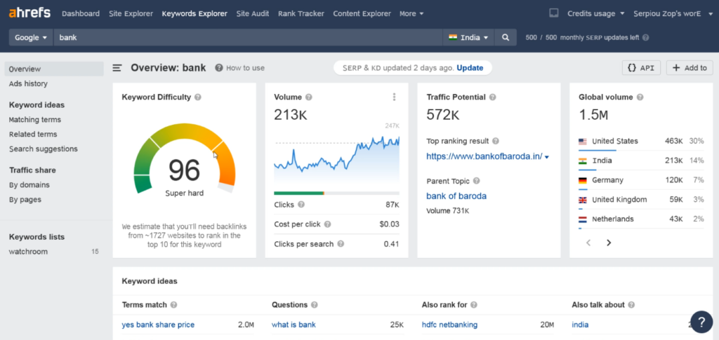
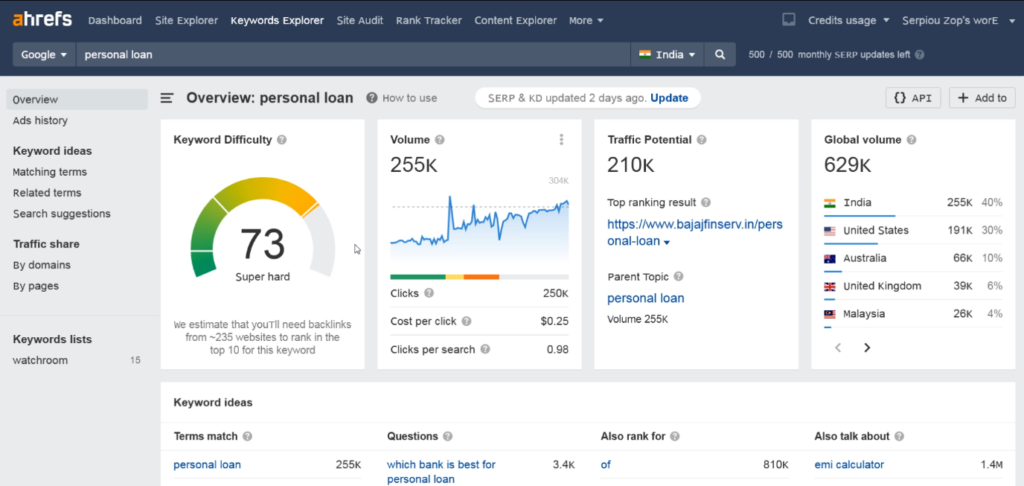
The other keyword I searched for – “personal loan” – is bit less hard (but only a wee bit) but has immense potential too. It has a higher search volume than “bank” because it is targeting a specific requirement.
Right then, I searched for “bank” on Google.co.in and I found a few banking sites. Let me examine them one by one for you and analyze the conversion elements they are using for selling their services online.
Bank of Baroda
Bank of Baroda is the first website that Google India shows for the keyword “bank.” It appears quite good to me at first look.
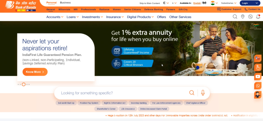
You can see that they have three levels of menus here. The first has only two options – Personal and Business – for the type of customer. The second level segregates visitors by customer segment, such as Millennials, NRIs, etc. Finally, the third level menu items list the major services they offer, such as Accounts, Loans, Investments, Insurance, etc. The interesting thing is that these menu items are arranged in the order of demand and usage.
Some visitors might find the screen a bit overwhelming. There are too many options on display. But I think Bank of Baroda is trying to show all the options that users might need and take them to the appropriate page with a minimal number of clicks.
The rest of the products are clubbed into Other Services. Maybe these are not popular enough to deserve their own menu option or maybe there aren’t many left either! 🙂
Moving on, let’s take a look at the sliding banner.
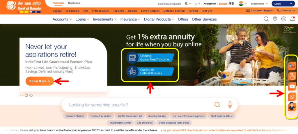
There are clickable buttons such as Know More, but the images are not clickable. The blue parts that say “Lifelong Guaranteed Income” and “Covers 20 Critical Illnesses” look like buttons but they aren’t clickable options. That’s a bad experience for the “reasonable internet surfer” in Google’s model.
On the right are different options to contact the bank – the little square buttons. These are also conversion elements. BOB provides a video chat option, which is very interesting. I don’t think any other banks offer such a facility. You can also chat with them using a normal chat box or WhatsApp, which is one of the most popular means of communication in India.
Customers looking to buy a financial product naturally have lots of questions. By giving them multiple interaction points, Bank of Baroda ensures that they are directed to the right product, faster.
Further down, there is an interesting search toolbar. It also has an option to search by voice. When you click inside, you’re taken to a separate screen:
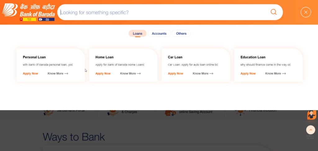
Not only can you type what you want, but you also have three main options – Loans, Accounts, Others. Each category has subcategories and they all have an Apply Now CTAs. These are great conversion elements that state their purpose clearly and take the user to the correct page.
Again, you don’t need to go through so many steps to get there. When I click on the Loans option in the top menu, I am taken to this page:
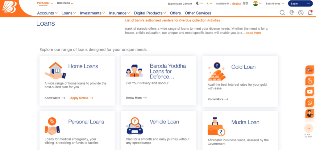
There are a lot many different types of loans. Scrolling down to the bottom of this page, you see CTAs that offer additional touchpoints. You have multiple ways of getting in touch with the bank – call, find an agent, find an office, leave your contact details, and FAQ. These are superb conversion elements that lead the customer to a service they want, using a mode of communication they are comfortable with.
Let me click on Home Loans and go to a third-level page down from the home page:
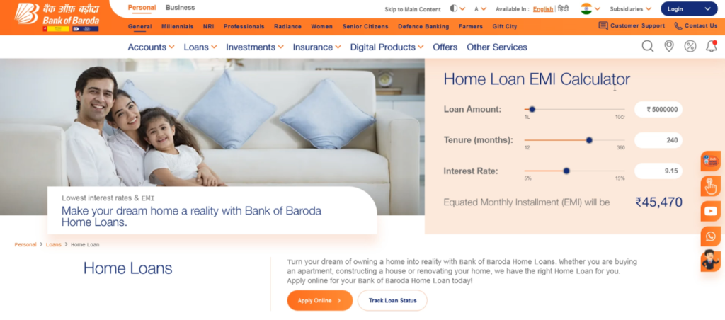
This page displays one of the most used widgets in the banking and finance industry – the EMI calculator. This is a useful tool that tells you the amount you have to pay every month as well as the interest rate, if you get a home loan from Bank of Baroda.
Bank of India
Bank of India is #2 in the SERP.
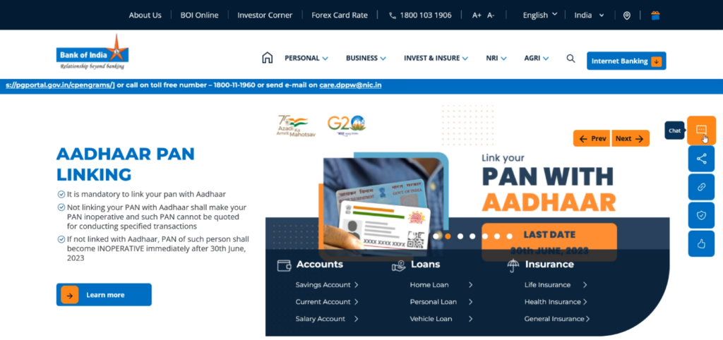
You see a layout similar to Bank of Baroda, with similar buttons on the right. The chat box is first.
Scrolling down a bit, you see options for the most popular products.
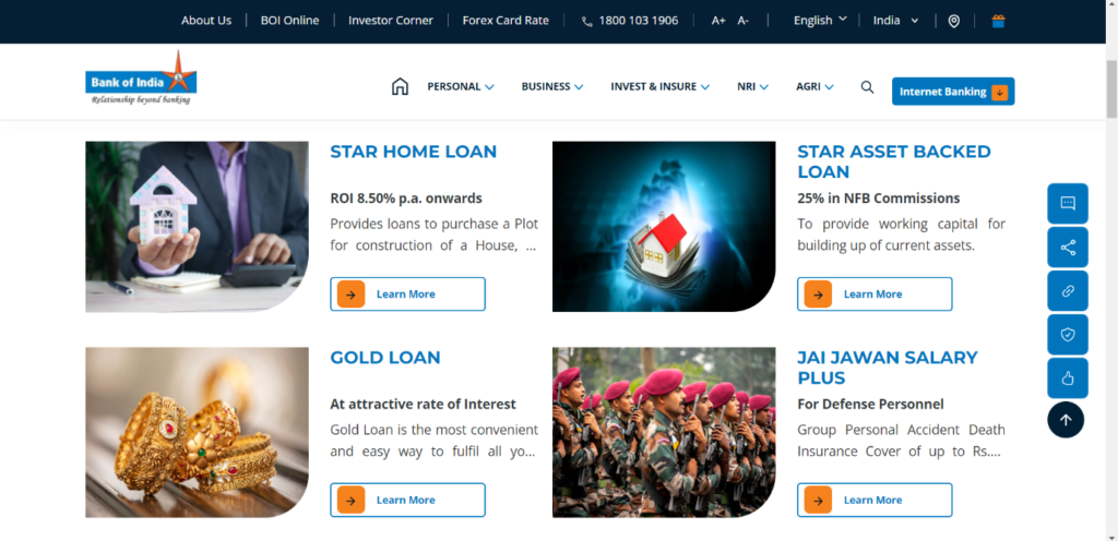
By clicking on the Learn More button, you’re taken to the specific page for that product. Here, you see a lot of information.
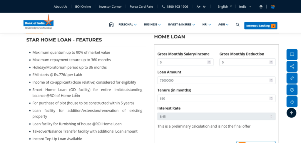
Note that information is also a very important conversion element of its own. If you want someone to buy an expensive product, it is essential to provide them as much information about it as possible as well as assuage their concerns, which is what Bank of India is doing here.
Again, balancing the amount of information you give out at every stage of the customer journey is crucial. Too much data will cause information overload and confusion. At the same time, you need to give them enough to address all their questions and enable them to make an informed decision they won’t regret.
Union Bank of India
Union Bank of India is what I see at number 3 on Google.co.in.
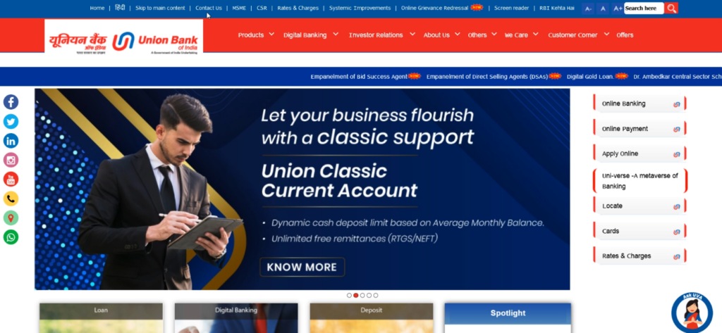
Again, there are two layers of menus here. Apart from that, you also see a marquee that provides information about new products, announcements and initiatives undertaken by the bank – in short, things that need to draw attention.
There is a list of very clear buttons for social media at the left – you can contact the bank on Facebook, Twitter, LinkedIn, Instagram, YouTube, Phone, Maps (to find physical branch locations) and WhatsApp.
One of the most important conversion factors of any website is information about the company. The About Us section of the website is the company’s opportunity to prove its credibility. Union Bank of India has a very comprehensive About Us section.
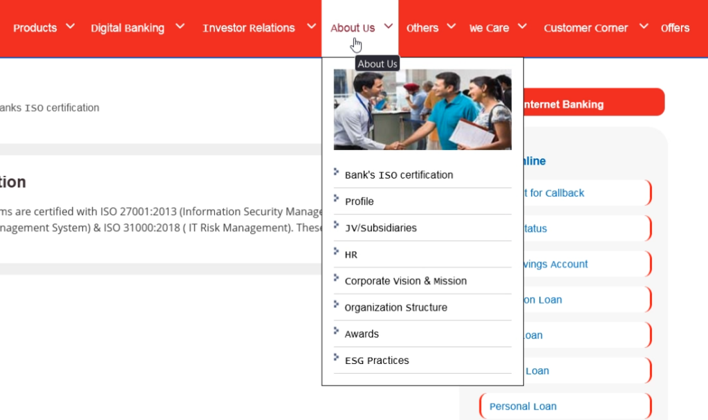
This section validates your company in the eyes of your audience and customers. Union Bank of India showcases their certifications, awards, organizational structure, vacancies, corporate vision and mission statement through their About Us section.
Proving an established offline presence is very important on the internet, especially in the finance industry. A lot of scam websites don’t have an About Us section; even if they do have one, it usually isn’t very convincing.
Indian Bank
Finally, let’s take a quick look at number 4, Indian Bank.
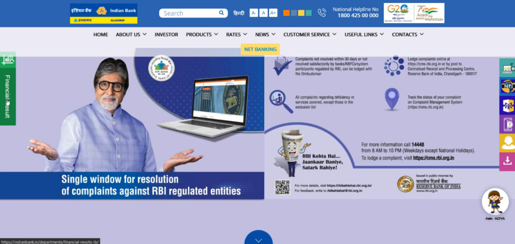
There is instant credibility on the home page, because they’ve used an image of Amitabh Bachchan. He is an actor much loved by people across India and the world. Having him as a brand ambassador creates an instant bond with website visitors.
Like the other banks, Indian Bank also has a set of buttons on the right. However, they are not contact options, they’re all CTAs that point to different products offered by the bank. Each button moves out and expands when you hover the mouse over it, which is a very good incentive to click it.
Scroll down a bit and you see some interesting stats that further increase the credibility of the bank.
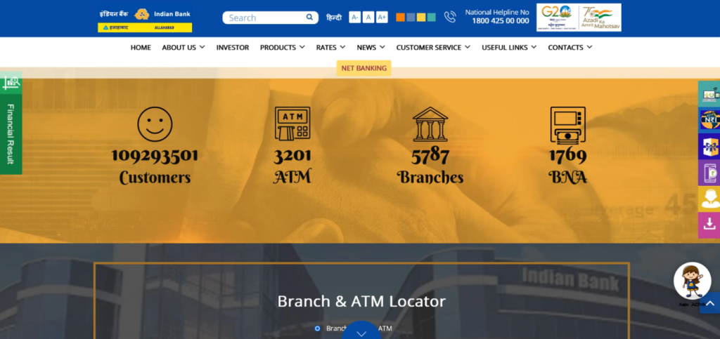
Stats also serve as conversion elements that inspire trust in potential customers. While small companies might be prone to make exaggerated claims, established institutions and companies operating in regulated industries don’t do so.
Just below that, there is a Branch & ATM locator, a critical tool to help customers find these without any trouble. You simply choose one, enter your pin code (zip code) or city and check out the list of branches or ATMs that turn up. This is equally useful for both potential and existing customers. If you’re applying for a loan or opening a new account, you’d ideally want your branch or ATM to be near where you live or work.
Link Building for Banks
So, we took an in-depth look at how banks can use conversion elements to sell their services to new customers as well as keep existing ones by helping them to quickly find what they’re looking for.
CRO is an additional way of influencing the SERPs. When you’re done with your on-page and technical SEO as well as conversion rate optimization, there is no other way to move the needle but to build links.
Having a great website isn’t enough to skyrocket your Google rankings. For that, you need a booster called link building. And that booster can be provided by Serpzilla! 🙂
For the banking and finance niche, we strongly recommend building contextual links from thematically relevant websites. A large number of links from non-relevant sites are okay for other niches, but the finance niche needs to gain Google’s trust.
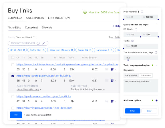
Serpzilla has two filters that are important for banks:
The first one is Topic, language and region:
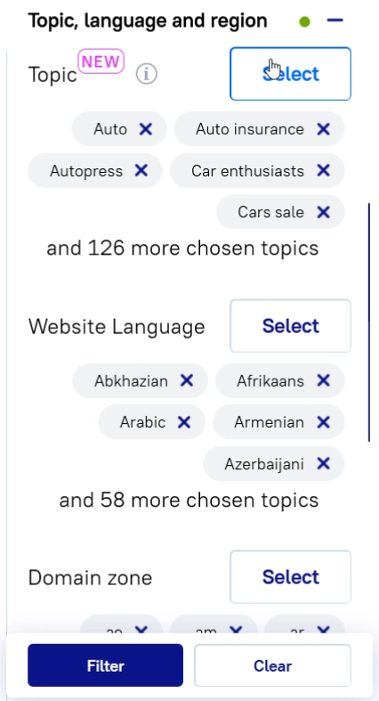
You can select topics like Insurance, Finance, and so on. If you already have a lot of links, you can also apply General to see what you get.
The other filter is Smart Topic, which we discussed in depth in this post. Smart Topic is an ML system that analyzes your website, then runs through our database of 100,000+ sites (with more than 1 billion pages) and extracts a list of relevant pages from which you can buy links. What’s more, these pages are sorted by relevance, based on the keywords that it identifies.
A caveat: Don’t use Smart Topic and the Topics filter together. They are not interoperable because one is manual (based on your wisdom) and the other is powered by algorithms.
In Conclusion
Don’t make the mistake of neglecting conversion elements. CRO has a very important role in SEO and should be considered a part of on-page SEO. It should be carried out before you start link building or off-page SEO.
Conversion elements may vary from one niche to another. For example, EMI calculators are a common sight on banking websites but you might not find them on fashion blogs. To decide the conversion elements that are important for your niche, you should first look at your goals. Credibility is one of the most important attributes that banks should showcase.
Banks need their customers to trust them, and so, their websites must be informative, professionally and thoughtfully designed, functionally perfect, and operate with zero downtime. If they do all of that consistently, they will see their conversion rates shoot up.


![10 Best Google AdSense Niches [2025]: A Practical Guide for Website Owners](https://serpzilla.com/blog/wp-content/uploads/2025/05/10-Best-Google-AdSense-Niches-540х360.jpg)
