3 Tweaks to Turn Your Landing Pages into Conversion Machines


You have an innovative product, you created great content around it, you built natural links to your pages, and you have a ton of visitors.
Now what?
Are you selling enough of your product?
Converting customers these days seems like a constant uphill battle. There are always new advertising strategies and companies with massive marketing budgets taking center stage that many smaller brands struggle to attract customers to their websites.
In fact, if HubSpot’s State of Inbound report is to be believed, the vast majority of marketers agree that driving in traffic is the most challenging part of their job year after year.
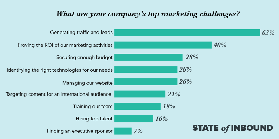 Source: https://www.stateofinbound.com/
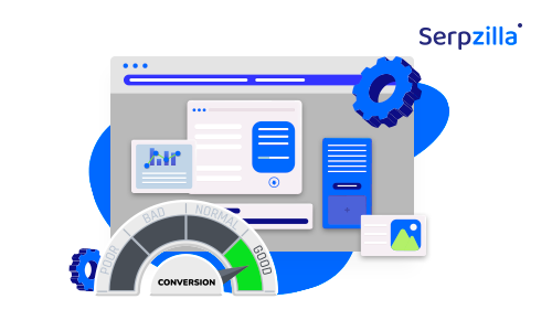
What is even sadder is that the average online business has just over a 2% conversion rate.
This means that 98% of your visitors are most likely not converting – and your landing page design could be to blame. Designers know that the devil is in the details, and the smallest changes could impact your customer’s behavior big time.
So, here are three simple but powerful tweaks that can have an impressive effect on your conversion rates.
1. Focus on “Above-the-Fold” CTAs
It is no surprise that customers these days have pretty short attention spans. After all, they are seeing thousands of advertisements on a daily basis and they are faced with constant distractions. Therefore, you are going to have to fight really hard to keep their attention during their short stay on your landing page. Better yet, you can just place the most important things at the top where they are most likely to see it.
According to a study from Nielsen Normal Group, customers spend 57% of their time looking above the fold on a page and very few scrolled all the way to the bottom. Consumer’s eyes also tend to bounce around to things that catch their eye rather than scroll from left to right like they do when reading a book.
Source: https://www.nngroup.com/articles/scrolling-and-attention/
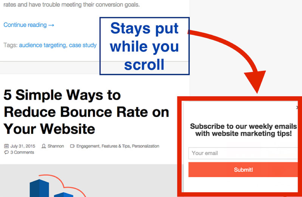
Therefore, you want to make the point of your page – or the USP of your product – crystal clear from the very beginning with CTAs placed above the fold. If you can’t make that happen for some reason, the alternative is a CTA that moves down the page as the customer scrolls. You can simply use a stick-on scroll plugin to create a CTA button that moves down the screen so it is always available.
Just make sure that this does not distract from the experience, particularly on mobile. Keep it small but noticeable – AddThis do this well on their blog posts:
 Source: https://www.invisionapp.com/inside-design/designing-email-list-cta/
2. Make Your Landing Page “Full-Featured”
If you have convinced a visitor to click on a link from an ad, then you have already set an expectation in their mind of what your website has to offer them. The customer is showing interest – so be sure that your landing page does not let them down.
Say the purpose of one of your landing pages is to have a visitor sign up for a free trial of your product. You would want to include multiple copy and elements on that page which convince the visitor to take an action you want. It would also make sense to have your landing page integrated with CRM, billing, email automation, and product management systems for better management of your workflow, so that you can address customers’ concerns all through the buyer’s journey.
For instance, a DIY platform such as Kajabi would have pre-built templates that allow for automated workflows, turning landing pages into critical touchpoints within multichannel buyer funnels.
This includes interactive elements with motion animation capabilities, carousels, coding blocks, video modals, etc. so you can build customized landing pages depending on the intent of your campaign – whether it’s to sell a subscription-based service, hype up a product launch, invite people to a webinar, or run a time-limited promotion.
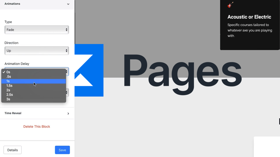
Make sure you use interactive content formats such as preview videos or animated GIFs to show how your product features work, and combine them unobtrusively with a data capture form.
3. Make Sure Help is Just a Click Away
According to a web usability study, 64% of customers are looking for contact info on your website and 44% will leave if they cannot receive assistance. What this means is, it’s super-essential to make sure support is always within reach of your visitors. Don’t shy away from displaying your contact information clearly.
Many designers will place contact information at the very bottom of the page or hide it behind a drop-down menu. While you certainly don’t want to distract customers on your landing page, offering contact details keeps people from running away. So, you might want to consider integrating a support contact CTA directly on your landing page, so that visitors can instantly get in touch with your business.
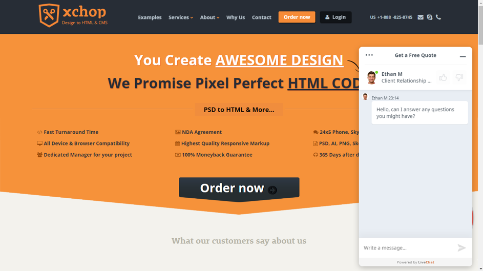
Live chat is another useful option, as this can be a friendly way to let the visitor know that they can ask a question and receive instant assistance without leaving the page. The key here is to be unobtrusive with your chat plugin, especially if it has a pop-up design.
For example, some pop-up chat boxes take up a large portion of the screen, and interrupt the visitor even before they’ve started reading the content on the page. Instead, it is better to keep the chat box as a small icon in a corner, so that the visitor can readily start using if they have a question to ask.
In Conclusion
Creating high-converting landing pages involves a lot more than just picking nice colors, cool images, and attractive fonts. There needs to be a lot of strategy included in the design process and each and every page needs to fulfil a specific purpose.
Even the smallest changes and design tweaks can have a strong impact on the effectiveness of your landing pages and conversions. The real key is to focus on the end user’s experience – why are they on that specific page, what do they want, and how can you provide that through that page? By keeping your visitors’ intentions in mind and designing accordingly, you can create an online conversion machine that is as successful as it is beautiful.